
The best gear for mobile video journalism and mobile filmmaking for broadcast TV and film productions. Low cost solutions! Essential mobile video Gear This is the mobile video gear you first need for your smartphone to start filming professional video. It will last a long time and you won’t be spending a lot of money. […]
Mobile Journalism Workshop
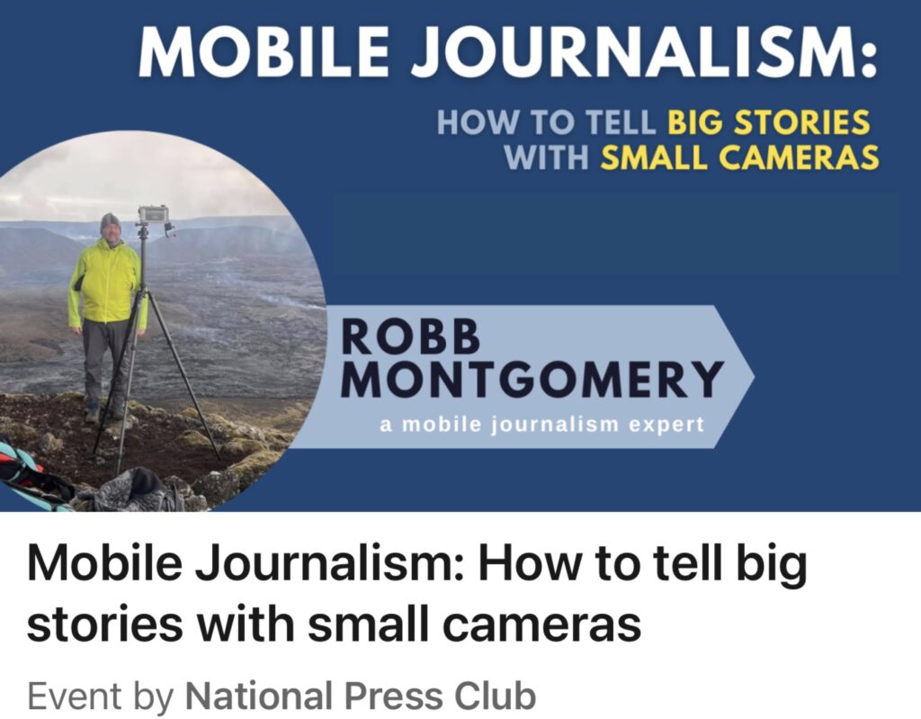
“How mobile journalists tell big stories with small cameras” The MOJO Workshop showcases the latest tech, tools, apps and techniques for field reporting with mobile gear. From breaking news reporting to filming mobile documentary in Ukraine, this perennial session always features fresh case studies and best practices of mobile journalism reports and documentaries from around […]
Ukrainian journalists in Berlin after leading #MobileJournalism workshops in Singapore, London and S...
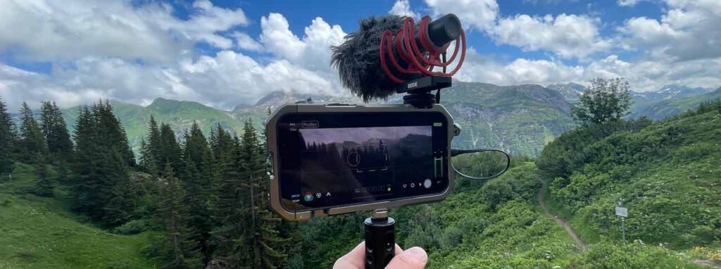
MOBILE JOURNALISM WORKSHOPS This summer I have been upgrading key pieces of my my mojo gear and testing them in the field. Testing new kit while hiking between Alpine mountain huts, kayak camping in Germany, and Cycling 400 kilometers to Prague over eight days. Travel adventure stories provide a broad palette of story forms to […]
Ukraine Mobile Journalism Workshops
UKRAINE: I spent two weeks teaching Mobile Journalism to frontline journalists — reporters who were forced to leave their homes and now live and report from elsewhere in the country. It was an honor to serve these courageous journalists and upskill them in Mojo techniques. I was recruited for the “Improving Media Resilience in Ukraine […]
National Parks #MojoTrek films
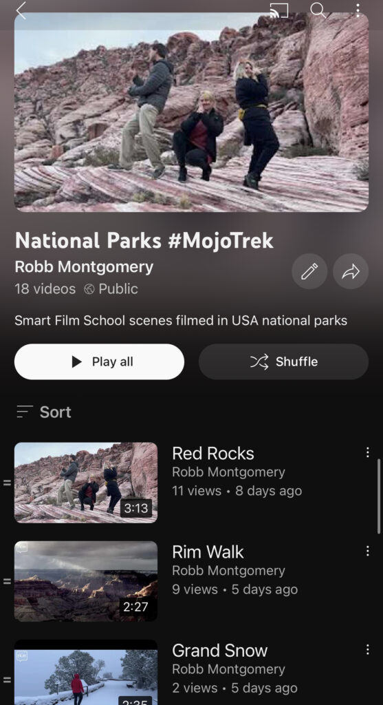
A playlist of my USA National Park #MojoTrek videos. Shot and edited on smartphone while hiking the trails of epic nature areas in the western states. #mobilephotography #MobileJournalism #Mojo Edited in #Lumafusion.
Build a low cost video studio in a spare room
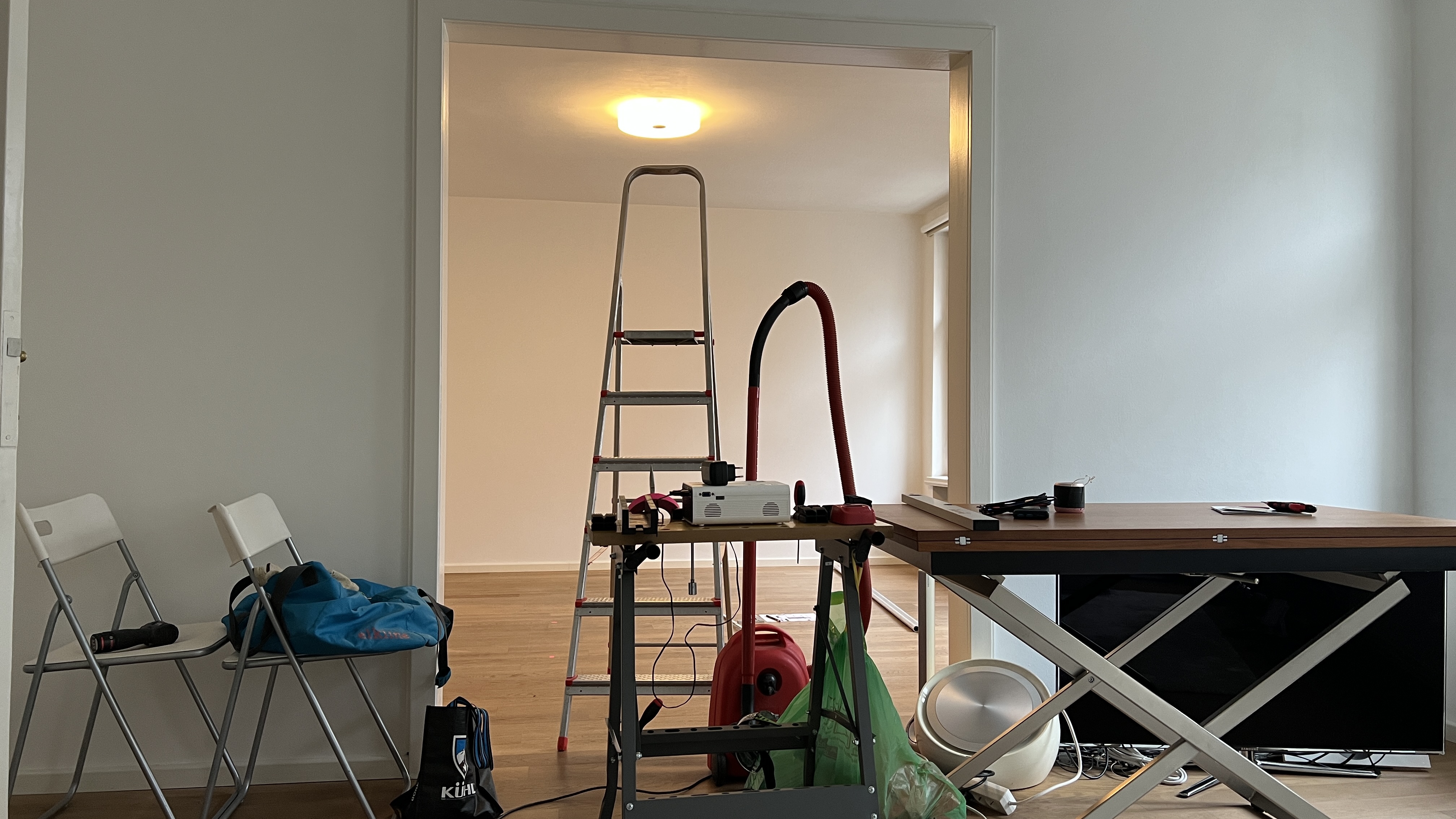
The Smart Film School is building a new studio. I will be sharing photos and notes of how I am transforming this second room in a typical German flat into a proper project studio for film and broadcast. Stay tuned . . . This post will be updated as the project moves along. is